April 30th, 2023
Hi Sam (not his/her real name),
You asked for more information, an example of how you (or I) might start to apply my Simple 2X4 Approach in this market. First let me reiterate that it takes money to make money in the market, a lot of money because good investments are expensive. So, if you are not already saving for your retirement, I'd like to suggest that you save 10% of your current earnings and learn how to live within the other 90%. When our savings can reliably through off enough cash to cover our average monthly cost of living, we can then retire. If you are just starting out and do not yet have enough cash to properly invest in the following four example index securities, than you should just Dollar-Cost Average into a traditional Total Stock Market Index fund (like ticker VTSAX, one of Vanguard's Index Funds). In time, you can move into funds like the examples below. While building up the size of your retirement savings. Start to follow the market's price action to develop a feel for Market's Nature. Learn how to do the following analysis and planning. Learn how to become consistently profitable so that your savings can grow to meet your retirement needs.
Many financial planners like to suggest that we simply divide our savings into equal amounts, or some formula based on age (which I do not advocate), and then rebalance periodically. So, let's start by allocating 20% of our investment capital in each major asset class through the following tickers or some other securities that gives us the same type of exposure. Let's commit to investing 1/5th of our savings in U.S. Large-Caps, the blue-chips (e.g., ticker SPY), 1/5th in U.S. Small-Caps (IWM) the higher risk but higher reward growth sector of the economy, 1/5th in U.S. Bonds (BND) or World Bonds (BNDW), 1/5th in International Stocks (EFA), and 1/5th in cash for a rare mega-investment opportunity and a major emergency. Because the U.S. blue-chip market is so attractive from a risk-vs-reward perspective and because mega-investment opportunities and emergencies are rare, I further suggest that we shift half of our cash reserve into the best part of our investment universe. That is, let's put 30% in ticker SPY (U.S. Large-Caps), 20% in ticker IWM (U.S. Small-Caps), 20% in ticker EFA (International Stocks), 20% in ticker BND (U.S. Bond Market) or BNDW (World Bond Market), and 10% in a Money Market fund (our cash reserve). Feel free to create your own asset allocation and rebalance once a year or every quarter, but this allocation suggestion is the best advice I can give you now.
As of the date of this letter, it is now the end of the week and month. So, this is a good time to review the full chart set for the four major asset classes that we can and should invest in. A full chart set is a multi-chart timeframe view of the same ticker, the symbol for a security or market index. We'll look at a monthly, weekly, and daily chart set. We want to analyze these charts to understand what the best investors and traders are doing with their money, to understand what Mr. Market (The Wisdom of Crowds) has to say about the various investment choices available to us to buy, sell, and hold in a brokerage savings account. This information is called the Message of the Market. Note that most of the trading volume seen in these charts is driven by professionals with a track record of success. There will always be some amount of noise (randomness), especially in quicker timeframes, and a natural margin for error in all charts. We want to learn how to properly perceive Mr. Market's signal in all this noise. This will come naturally in time given patience, persistence, and attention to detail because our brains are very good at seeing repeating patterns in any data.
We need to learn how to see repeatable patterns with favorable odds, like those identified below. We can learn how to exploit the patterns. Let's focus on those patterns that put money in our pockets and ignore all the others. It is possible to learn how to better time the pattern repetition rate, but we don't need to rely on that hard to accomplish skill. Just knowing that a pattern is likely to reoccur sooner or later allows us to put in a Limit Order and just wait for Mr. Market to do what he does over-and-over again. The harder timing skill may come naturally in time, just like learning how to surf or ski moguls. If I and many others can learn how to become consistently profitable, then so can you! Right?
We look at longer timeframes because the information there shows the bigger picture and is more fundamentally grounded. It is easier to become consistently profitable in longer timeframes. But longer timeframes require more time (patience). We look at quicker timeframes to see if we can become consistently profitable sooner. But these quicker timeframes are noisier and dominated by the best traders in the world.
In each chart timeframe, we want to Analyze the Broader Market Trend, the Health of that Trend, and the Trading Range (TR) seen in each timeframe. A healthy trend is likely to continue and to reverse near TR tops or bottoms. We want our market operations to be driven by this information (our data analysis). Recall that our primary goal is to be a Consistently Profitable Trader (CPT). To that end, we should only own investments (securities) that can survive volatile markets and that'll pay us to hold while we wait for our next capital gain earned by buying in the lower half of the current TR (a.k.a., S/R Channel) and selling in the upper half of that TR, over-and-over again. The range of prices seen reflects the market's collective view of likely future value. That is, when prices get too low, near the lower end of the TR seen in the chart, more-and-more active professional traders and investors are willing to be buyers, and that extra buying power at discount prices creates Support for higher prices. The alternative is also true, when prices are near the top of that same S/R Channel, professional selling at premium prices creates Resistance to higher prices. Our secondary goal is to be a CPT in the quickest possible timeframe. Trouble is, the quicker we try to earn those capital gains, the harder it becomes because TRs in quicker timeframes can surprisingly shift up and down in response to news and commentary. It is not uncommon to buy in the lower half of the current TR only to find that TR has shifted down shortly after, putting that buy in an equity drawdown condition, which means we're going to have to wait, maybe a long while, for prices to shift back up. That's the main reason we want to be paid to wait. That's also why the pros like to scale in and out. They don't try to buy the perfect bottom and sell the perfect top in each TR. It's just too hard to do, even once, and even harder to do with any consistency. Besides, carving out a good chuck of each price swing within any TR is more than good enough when we factor in compounding, which is the real key to Wealth Creation in Markets. What they do is break up their trading power into smaller portions, and that allows each atomic buy or sell transaction to stand on its own or be combined with other parts of a larger position in that security to yield acceptable profits sooner-or-later, over-and-over again. They've converted the buy low and sell high prices into two average that they can manage and optimize. The buy low trade becomes the average price per share for the whole position, which is also the break-even price. The sell high transaction becomes the average rate of return from a compounding perspective. Note that prices can always go lower after we buy and higher after we sell. Assuming we have enough investment capital, scaling in and out allows us to almost always have some skin in the game. You must be in it, to win it. That is, earn the market rate of return, and when compounded over a couple of decades can allow us to retire.
Profitable trading is mostly about specialization and methodical operations with favorable odds, which are driven by correctly understanding the Message of the Market (i.e., being able to profitably analyze the current chart set or just having a process that yields consistent profits). Look for repeatable patterns in the data, understanding the historic odds of that pattern repeating (sooner or later), and then projecting that into the future. It also helps a lot to understand the broader economic context; but that is not required because the chart set reflects the applied wisdom of all that smart professional investment management as indicated in Charley Ellis' classic book, Winning the Loser's Game . Profitable investing is all about focusing our time and capital on a few dissimilar investments that can survive volatile markets, that'll pay us a market rate of return to hold, and that are likely to see higher prices sooner or later thanks to economic growth, which has us invest when prices are near the lower end of broader up trending channel and harvesting profits when prices are selling near the top, over-and-over again. Learning how to do both is even better. Let my Simple 2X4 Approach work for you. Feel free to develop your own methodology that plays to your natural strengths. But keep my primary goal, be a CPT.
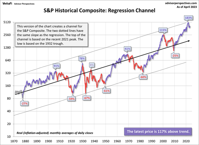
The following is a very longer-term chart of the Total U.S. Stock Market going back as far as we have good data. It tells me that we need to be prepared for a major drop like we've seen in the past, and that's why we have a cash reserve account, to buy that dip. The thing is, that may not happen any time soon or it can happen tomorrow. This chart also shows the broader market trend, the health of that trend, and the broader trading range. The dark black regression line shows the broader market trend, which is the average of all prior prices. The two dashed channel lines that are based on the highest and lowest prices (pivot highs and lows) define the broader trading range. Current prices relative to these three lines indicate that market prices are trading at a premium but have pulled back. The big question is, "Where are prices likely to go from here?" That is unknowable. However, we can use the following information to work whatever future market we get to live through. Note that these lines should be used as a guide to help you understand what to look for and to see the concepts presented in this letter and to develop an understanding of what all this data means. It helps to understand that current market prices are based on our collective beliefs about likely future value, and that our current economy is a lot more productive and therefore valuable than in the past. However, war and natural disaster can destroy large parts of our economy and that could cause the next sharp move down.
Let's talk about what we can see in each chart (timeframe) below.
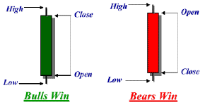 Each candlestick bar
in each chart shows the range of prices seen in that sample size.
That is, on a daily chart each bar shows the price of the first trade (a.k.a., the Open),
the highest price (the High), the lowest price (the Low), and the last price (the Close).
On a weekly chart, each bar summarizes the trading seen in each week,
but it takes a week to build that far right bar, and so on for the monthly chart, etc.
The bar on the far-right side of the chart is the latest or current bar.
Because it is the end of the week and month,
we have the two far right-hand bars on each of these charts to properly consider.
Right or wrong, many pros say,
"Let the current (far right) bar complete before factoring it into your analysis of the Message of the Market in that timeframe."
However, I think we can learn how to properly factor in an evolving situation.
In the charts below,
I use the color green to indicate bars that have the Open below the Close,
meaning an up bar where the Bulls won that sample period,
and red for bars with the Open above the Close,
meaning the Bears won that bar.
However, these shorter-term bars (TRs) are of limited value in each chart.
The real value is in seeing the broader TR as indicated by some of the highest and lowest bars
seen in that same chart,
and how these bars react to other information in these charts,
which I'll address below.
Under each bar we see the associated volume,
the number of shares traded in that period.
Note that big (Smart) money buying or selling creates bigger than average volume.
Our operations in the market should be in-synch with the bigger than average volume.
That is,
we should initially trade with the bigger, smarter money
because they are better at doing the fundamental analysis
that ultimately drive prices forward.
But in time we can and should learn how to compete with them
because it takes time for them to do their buying and selling in longer timeframes.
In the following charts,
I include four standard Moving Averages (MA) and RSI.
Each candlestick bar
in each chart shows the range of prices seen in that sample size.
That is, on a daily chart each bar shows the price of the first trade (a.k.a., the Open),
the highest price (the High), the lowest price (the Low), and the last price (the Close).
On a weekly chart, each bar summarizes the trading seen in each week,
but it takes a week to build that far right bar, and so on for the monthly chart, etc.
The bar on the far-right side of the chart is the latest or current bar.
Because it is the end of the week and month,
we have the two far right-hand bars on each of these charts to properly consider.
Right or wrong, many pros say,
"Let the current (far right) bar complete before factoring it into your analysis of the Message of the Market in that timeframe."
However, I think we can learn how to properly factor in an evolving situation.
In the charts below,
I use the color green to indicate bars that have the Open below the Close,
meaning an up bar where the Bulls won that sample period,
and red for bars with the Open above the Close,
meaning the Bears won that bar.
However, these shorter-term bars (TRs) are of limited value in each chart.
The real value is in seeing the broader TR as indicated by some of the highest and lowest bars
seen in that same chart,
and how these bars react to other information in these charts,
which I'll address below.
Under each bar we see the associated volume,
the number of shares traded in that period.
Note that big (Smart) money buying or selling creates bigger than average volume.
Our operations in the market should be in-synch with the bigger than average volume.
That is,
we should initially trade with the bigger, smarter money
because they are better at doing the fundamental analysis
that ultimately drive prices forward.
But in time we can and should learn how to compete with them
because it takes time for them to do their buying and selling in longer timeframes.
In the following charts,
I include four standard Moving Averages (MA) and RSI.
It's best if our charts show us the same information seen by most pros and their super computers. We need to see the same patterns that they are seeing. Daily and longer-term charts need to be set to Log Scale. Intraday charts are set to Normal or non-Log Scale. Beginners should ignore the intraday charts because CPT status is much easier to achieve in longer timeframes. My charts include the 20-, 50-, 100- & 200-period Simple Moving Averages (SMAs or just MAs) and RSI.These MAs act like automatic trend lines. They smooth out the noise volatile markets can generate. On average, market prices are a good predictor of likely future value, however, any individual sample (bar) may not be very predictive of likely future value; but could be a favorable buying or selling opportunity for those monitoring the price action. We need to see how prices trade relative to these MAs as that helps us understand that message of the market, to see the trend, and the health of each trend. Focus on how the bars trade relative to these MAs and prior pivot highs and lows (prior support and resistance). The blue 20-period MA is the quickest automatic trend line, but also the most likely to be wrong. The red 50-period is the intermediate MA and is just a little more likely to be predictive of likely future outcomes. However, the real value of the 20 and 50 is how market prices tend to ride these MAs higher and lower. The gold 100- and green 200-period MAs are longer-term averages and are a lot more likely to be predictive of future value. That is, prices closer to these MA are more likely to yield an acceptable profit sooner-or-later. Notice how prices in a bull market like to trade above the 20- and 50-period MAs and use them for support. That is, in a healthy uptrend prices like to ride these MA higher until they get to the top of a broader TR (or a longer-term MA). The alternative is true in bear markets, prices tend to trade below the 20- and 50-period MAs and ride them lower. In a healthy trend, prices like to bounce off the 20 and 50, and sometimes the 100 and 200, and don't forget to look at volume. There should be a little more volume on those bar moving in the direction of the primary trend, and a little less volume on the counter-trend bars. Look for all that in the chart set below. But when prices get too far above or below the 20, or when these MAs get spread out vertically, or when prices approach the top or bottom of a TR, that trend becomes less healthy and is more likely to reverse, putting a pivot in the chart, which is also indicated by marked prices in the charts below. We want to focus on these pivot highs and lows as they indicate the TR size(s) seen in that timeframe. However, TRs should be viewed as a general area when projected into the future. Don't think the future will look exactly like the past. It is more likely to resemble the past, but with different timing intervals, which is why trading is so hard. On top of each chart, we see RSI, an indicator that tracks rate of change. When prices move up too quickly RSI rises towards the 70% level or above, which indicates an overbought condition, and RSI at or below 30% signals an oversold condition. The odds favor buying an oversold condition and selling an overbought condition but is no guarantee of a quick profit. The odds also favor buying a drop to a rising MA and sell a rally away from the entry MA. Look for these patterns in the chart set below.
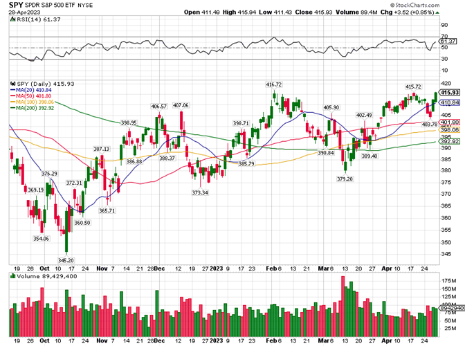
Let's consider each chart set below starting with ticker SPY, an ETF for the U.S. Large-Cap Index (the blue-chips). We can also use ticker (SPLG), which has a more affordable price tag but gives us exposure to the same basket of securities and is a newer ETF. We'd like to take quicker profits in quicker (smaller) TRs when we can and hold for acceptable profits in long (bigger) TR when we must to retain CPT status. That is, let's try to be a CPT in the daily timeframe, but be prepared to work the weekly and monthly charts when Mr. Market turns bearish. So, we'll try to profitably trade the daily charts below, but use the longer timeframes to plan how we may need to manage our position to earn the best rate of return our skills and Mr. Market will permit.
I suggest that we learn how to analyze each ticker in multiple timeframes. Dr. Alexander Elder's introduced his Triple Screen Trading system in his classic book Trading for a Living, where he suggests that we use the next longer timeframe to set our trading bias. For example, let's say we're trading the weekly chart. We'll use a healthy trend in a monthly chart to determine if it is best to go long or short. A lack of a healthy trend indicates that it is best to just wait in cash for a better trading environment or look elsewhere for better odds of success. We'll use the current (weekly) timeframe to enter and exit a trade. Assuming a healthy trading environment, we'll use a counter trend move into support or resistance to enter, add to, exit, or reduce the size of our position. We'll use the next shorter-term (daily) timeframe to time the trade as prices begin to move with the broader-market (primary) trend. This is a true professional trading tactic with very favorable odds.
In the following monthly chart, my eye sees a bull market that got overbought multiple times with RSI above 70%. Note that a market can be overbought for a while before correcting. In each correction, we see prices drop to find support on a rising MAs and then resume the primary (up) trend. However, at the end of 2022, we see an overbought condition with prices will above the 20 and all MAs are spread out vertically. This is a classic signal of a market that is primed for a correction. We don't see this in the chart, but fundamentally speaking the economy was overheating with inflation rising thanks to too low interest rates for too long. Plus, there were classic topping signs of new bullish news failing to make new higher highs. The Smart Money was selling to those less informed savers. The alternative is also true, when new bad news fails to create a new lower pivot low. Look for larger than average volume. This is The Smart Money trading against the news. At this time, prices are at the blue 20-month MA and most of the TR in 2022, which has prices trapped between the 20- and 50-month MAs. This could be Major Resistance, a good time to harvest some acceptable profit. However, it could also be the start of a TR shift up where, the 20 becomes support and the 470ish prior high becomes Major Resistance, maybe later this year or next. We should plan to buy any drop to the rising red 50-month MA and every lower MA and prior pivot low like at 250ish as indicated by prices finding support in Q1 of 2020, the Covid shutdown, which was an example of putting a cash reserve to work. All rallies to new highs should be used to build that cash reserve back up. That is, take some profit.
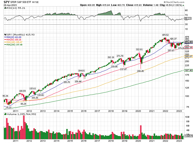
In the following weekly chart of SPY, I see prices testing resistance at the yellow 100-week MA which is also the top of the TR seen over the prior year. Here too, let's plan to buy any drop to a rising MA in this timeframe. This chart looks longer-term bullish but could be near-term bearish. But I can be wrong. Timing mistakes will be made, but my approach can enable us to convert these into acceptable profits sooner-or-later, when we scale in on bigger intervals and size that work to really pull down our break-even price for any investment in this ticker. Think like an investor but learn how to trade to enhance investment returns.
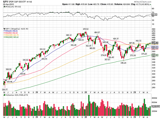
In the following daily chart, I see into the bar details of the charts above. If we have only cash and no SPY, we might want to buy a very small amount of this ticker on any drop to say the 405ish area, thus giving us a little exposure to very good news that is possible. Here too, we want to scale in on any price weakness and scale back out as Mr. Market shows us acceptable profits are prices approach likely resistance. We should use the pivot lows seen on this (any) chart to identify likely future support. We can also use the pivot highs to identify likely future resistance. The pivots can be identified by the prices above the pivot highs and below the pivot lows. Support and resistance are also likely to happen as prices approach an MA. Can you see the cyclical patterns of prices trading (trending) up into resistance and then back down into support, over-and-over again? Can you see these TRs shifting up and down in quicker timeframes? Can you see these TRs expand and contract? I see lots of opportunities to scale in and out booking one profit after another. Take another look at this chart set.
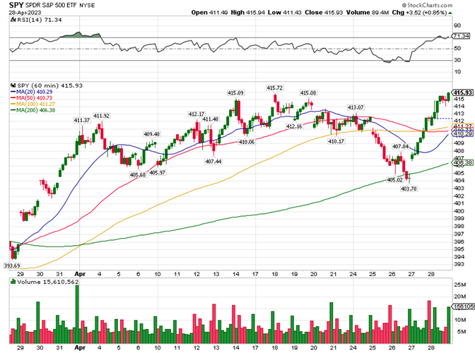
This is the hourly chart of SPY, and it is only here to show how self-similar these charting timeframes can be. This timeframe is much harder to profitably trade. Our approach of buying support, in the lower-end of the channel seen in a chart timeframe, and selling into resistance, in the upper-end of that same channel has us competing with the professionals that specialize in that security and timeframe. When the timeframe is larger, like a monthly or weekly and maybe a daily chart, most of the professionals will be investors managing larger portfolios. They need time to do their buying and selling, which gives us room for error. A small timing mistake in these timeframes are not likely to hurt our longer-term outcome. That's why we should seek our initial CPT status in slower (bigger) timeframes. However, trying to do the same thing in quicker (smaller) timeframes like within an intraday chart like this or the next one forces us to compete with some of the best traders in the world. Small timing mistakes in these timeframes can quickly result in dead money or a forced stop-loss trade to free up your trading capital. Too many of these stop-loss trades can hollow out a savings account. Never forget our primary goal is to be Consistently Profitable, and that is very hard to do in this timeframe, if not already accomplished in the next higher timeframe.
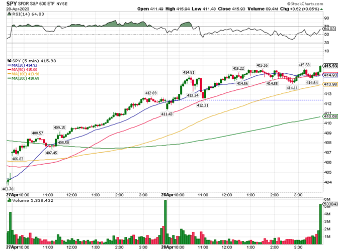
This 5-minute chart of SPY is also here to show these S/R Channels have a noisy, erratic, quasi-fractal (self-similar) relationship. This timeframe is ruled by the best professional traders in the world and their super computers that are programmed by a team of professionals. It is possible to get lucky, if you wait for a very favorable setup and that trade setup goes your way. But what if it doesn't? What's your plan to manage that possibility? The historic odds say, The Fast Money pros operating in this timeframe are going to get your money sooner or later if you try to out-trade them. This is how you Lose the Winner's Game. Leave this timeframe to the pros. Maybe in time, you'll develop the skill to be a CPT in the hourly timeframe. But first see if you can be a CPT in the daily timeframe. If that fails, work the weekly chart, and so on until you become a CPT. Commit to being Consistently Profitable. If that fails, just DCA the Total Stock Market Index, and find a better use of your time.
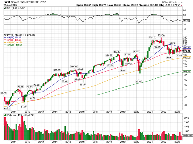
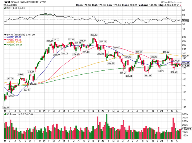
The following chart set is of the Russell 2000 ETF, a security that exposes investors to U.S. Small-Caps. My eye sees in the following monthly chart as a similar story to the one I told above, except that prices are closer to the rising 50 and I would buy a little here. But be prepared to buy more at lower MAs. We could use the blue 20 as a profit target for this purchase or we could sell half and hold the other half of that buy for a test of resistance at the 200 level and then buy back in on any weakness.
In the following weekly chart, I see prices are close to the bottom of the TR seen over the prior year, that is support near 16X and resistance near 19X. We should try to trade all future swings in this TR.
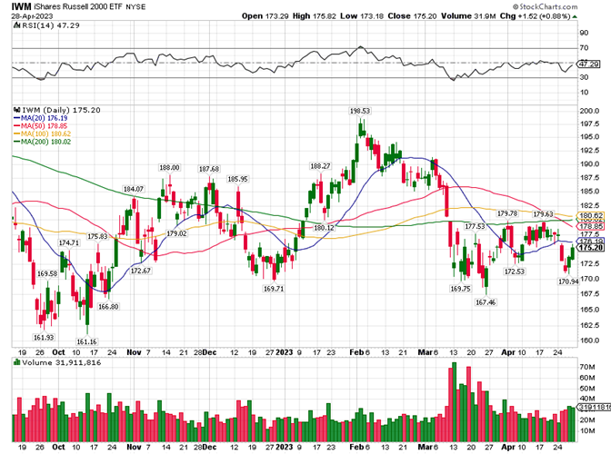
In the following daily chart, we see into the bars above. Let's buy a little on any drop to the 170+ area. Don't target the prefect low. Get in near the low and out on any rally towards the high, and book that capital gain, over-and-over again.
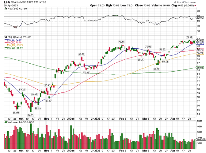
The following monthly chart of is of EFA, a security that gives investors exposure to the best part of the rest of the planet. Here again, we see another variation on the story above. Like SPY, this ticker is more bullish than IWM. All asset classes go in and out of favor over-and-over again. It's hard to know when, but it is not that hard to monitor the price action and trade accordingly. All we need to do is track our trading details, analyze the data, plan out the alternative possibilities, trade that plan, and learn from the results. Periodically monitoring market prices and comparing them to our books allows us to better understand if it is now better to buy, sell, or wait for better prices. Just scale in on any drop to a rising MA or prior pivot low. Understand that prices may continue to drop to a lower low. So, save some buying power for that. Prices can also quickly reverse and rally to put in a new high. Such is Mr. Market's capricious nature. There will be lots of opportunities to buy low and to take profits at some higher price over-and-over again. All we need is money, time, and a willingness to learn how to profitably play Mr. Market's game. This chart shows us a broader up trending S/R Channel, just like the other two tickers above. Can you see it? If not, we can use the green 200-month or gold 100-month MAs as the lower channel guide. We can also image or draw a line that connects the pivot lows creating an up trending support line. We can do the same for the channel top, just image or draw a line that connects the pivot highs. Just to be clear, channel lines are not hard and fixed. They should be used as a guide where prices are very likely to find support and resistance. This is the longer-term S/R Channel (trading range) to work. We want to take a profitable chunk out of every price swing within this trading range and timeframe. So, let's buy a little at any relative discount just to have exposure to surprisingly good news and higher prices, and then manage the position from there. Based on our analysis, we can use Limit Orders to target likely buying and selling opportunities. While monitoring the price action in real time and when we see a favorable opportunity, we can use a Market Order to force a trade at or about current prices. Most of the time, it is best to use Limit Orders, but there will be rare occasions where any trade in the current price range is likely to yield an above average return. Market opportunities will come and go, over-and-over again. But will only be there for traders and investors that have the ability to see the opportunity, the wherewithal to make that trade, and a willingness to just go for it!
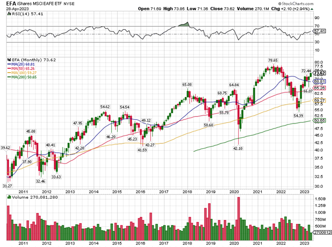
In the following weekly chart, I see a bullish price pattern with RSI above 50% but still below 70%, bullish territory. If I had an attractive profit to harvest, I'd take some of all of that at current levels because prices look like they are going higher, but RSI is not making a pattern of higher highs. We're seeing a possible bearish divergence pattern. If prices do pull back, I see a buying opportunity just above the yellow 100-week MA and at the rising blue 20. We can target the 76 to 79 range for longer-term profits.
In the following daily chart, we see lots of opportunities to buy into any rising MA or prior pivot-low support level. But we may need to scale further in. Prices can always drop further after we buy, maybe a lot further, and we'll then need to manage our cost-basis (a.k.a., our break-even price). This means we want each additional commitment of cash to really work to pull down our break-even price so that we can get into profit territory sooner in the next or some future upswing. We can then scale back out or whatever makes sense given the market environment then. Note that it is just a matter of time until this ticker puts in a new all-time high or at least tests the prior all-time high resistance level. We'll want to own some exposure to that likelihood. Ideally, we want to leverage the information seen in these charts so that we might more efficiently work each price swing and channel shift. But that is not required to be a CPT. We just need to effectively manage and optimize our two averages or just wait until we have an acceptable profit to harvest, over-and-over again. That's the primary reason for these Rules. Right?
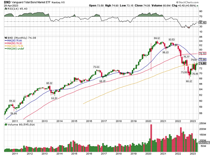
The following monthly chart is of the U.S. Bonds (the chart for BND and BNDW are very similar, either is good, BND has been around for a longer period of time and that's the only reason I focus on it here). In it I see, a bull market that turned bearish as indicated by the Double Top. It would not surprise me to see more bearishness. Bonds, unlike stocks, have no growth component. Our growth biased economy will not drive bond prices higher over time. Their prices are driven by inflation and government policies. With that said, this security does pay you to hold, is very survivable, and also trades up and down in a range that we can exploit. In this chart, I see prices testing resistance at the gold 100-month MA, which was support but is now resistance. I also think the blue declining 20-month MA is likely to be near-term resistance too. However, it is also possible that prices can break through near-term resistance, then trade between the gold 100- and red 50-month MAs. That is, the current TR can possibly shift up. Based on this chart, BND is not a buy at this time, it is a sell, if you have profitable shares to harvest. Otherwise, wait to enter at lower prices or on a drop to a rising MA or on a test of resistance turned into support. I would start a new position in a drop the 72ish level as indicated by the 71.61 pivot high back in mid-2016. This is what my eye sees when I look at this chart. In time, your eye will learn how to see profitable trading opportunities too. Until then, focus on being a CPT. Watch these evolving chart sets and learning how to read the Message of the Market. This should naturally come in time as you track your trading details, do this Technical Analysis, and use both to plan out your trades, trade your plans, and learn from the results. I understand that this sounds like a lot of work, and it is at first. But in time is becomes second nature. Plus, with a lot more money, you'll find that it doesn't take that much effort to cover your average monthly cost of living. Like any new job, this initial effort is the price to be paid to earn the rate of return that possible on Wall Street. You don't have to work at a traditional job forever. But that's your call. All this has enabled me to retire early and in comfort.
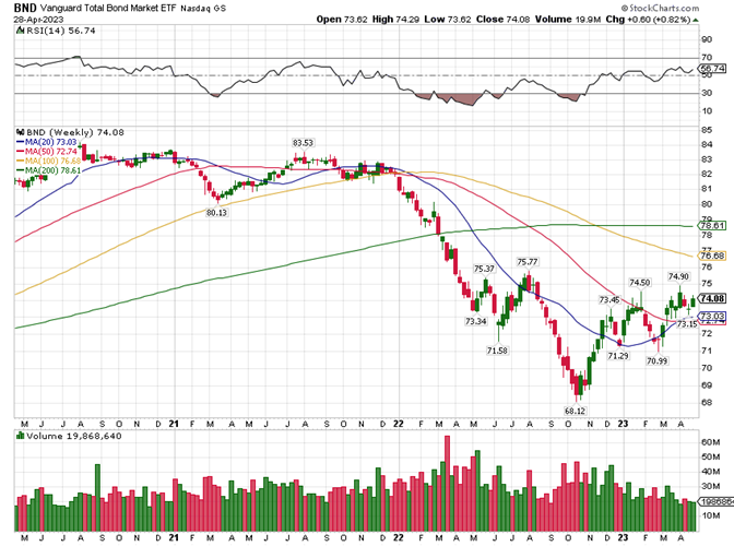
In the following weekly chart, I see a possible bear to bull reversal in Oct. of `22 as indicated by an Inverse Head and Shoulders Bottom. I also see a bullish RSI divergence, where prices made a lower low going from 71.58 in June to 68.12 in October, but RSI made a higher low in that timeframe. I think the near-term lows are in but the longer-term is unclear based on the bearish monthly chart above. Furthermore, the economic fundamentals and current Fed Speak make me feel bearish longer-term too. Note that the FOMC meets again this week, and their announcement at 2 pm on May 3rd can drive market prices higher or lower, which allows us to buy low (support) and take a profit at some higher price. With that said, this chart looks bullish to me near-term and that's the way I'd look to play it. As noted above, we should use the pivot lows seen on this chart to identify likely future support buying opportunities. We can also use the pivot highs to identify likely future resistance. The pivots can be identified on these charts by the prices above the pivot highs and below the pivot lows. Support and resistance are also likely to happen as prices approach an MA too. The rising 20- and 50- should act like support, but there's no guarantee. The falling 100- and 200- should act like resistance. These MAs are likely to define the size of the TR near-term. But not forever. Surprising news and commentary can easily drive prices through an S/R Level, which tends to convert one to the other as TRs shift up or down. Once again, don't try to pick the perfect TR top or bottom. We want to be sure to get in and out with a profit to attain and maintain CPT status. And don't go all in or out. Scale in and out to be able to take advantage of price improvement as TRs shift up and down.
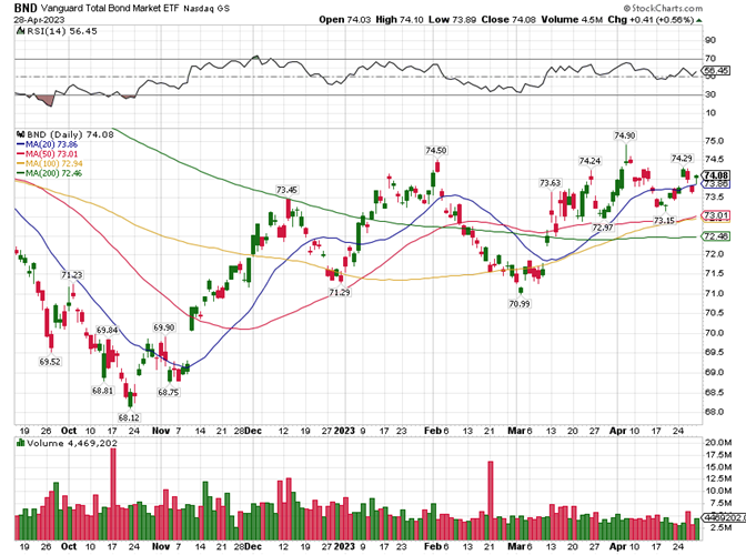
In the following daily chart, we see into the bars above. We also see the top of a trading range at or just below 74.5, the pivot highs seen in this chart. The lower end of that TR is at or above 71 as defined by the pivot lows. So, buy a little above 71 and sell a little below 74.5 or whatever the evolving market suggests is best. Every moment the market is open for trading, we'll get new information. Most of this will be noise, but not all of it. Focus on the information in longer timeframes and trade against the information in shorter timeframes. Work to profitably trade the TRs seen in this chart and all the charts above. You can do this, just start now. Be methodical. Plan out your trades, trade your plan, and learn from the results. Scale in and out based on the cash you have to invest and the size of the TRs you see in each timeframe. Be a buyer in the lower half of all these TRs, and a seller in the upper half when you have an acceptable profit to protect. Focus on being a CPT in your best possible OET.
Be careful not to drink Mr. Market's Kool-Aid. It takes bad news and commentary to see discount prices. It takes a lot of continuous bad news and commentary to reach major support like at the bottom of the trading range seen on a monthly chart. Major support is where the primary downtrend puts in a pivot bottom and becomes the next primary uptrend. Don't get scared out at these lows. This is a time to buy, if you have cash to invest. If not, take comfort in the knowledge that you own a security that can survive, that'll pay you to hold, and that a recovery is just a matter of time. The alternative is similar but not the same. It takes a lot of good news to drive prices to major resistance. But there will come a time when prices fail to make a new high on even more good news and commentary. When you see this near the top of a TR on a monthly chart, get out and stay out. Focus your time and that money on a survivable investment that has already been out of favor for a while or just park that cash in a money market fund and wait for prices to stop going down on more bad news. When the primary trend turns down on a monthly chart, it could take months to find major support like at a longer-term rising MA or at a prior bigger pivot low or after putting in a bigger pivot low that is well below a longer-term MA. With these thoughts in mind, go back and look at the monthly and weekly charts above. Do you see these patterns? They are there, and in time you'll learn to see them too. Until then, commit to doing whatever it takes to be consistently profitable so that your hard-earned savings can grow to fund your retirement.
Timing mistakes will be made. They are unavoidable. But you can overcome these, and in time convert them into an acceptable profit. Just periodically monitor the market's price action and track your trading details so that you can know if current market prices favor a buy, sell, or it is best to just wait for better prices, which will happen most of the time.
Big mistakes like trading on margin or in inappropriate securities or timeframes are avoidable. A big mistake occurs when you are forced to accept a capital loss. This can happen when you invest in securities that may not survive volatile markets or you attempt trades and timeframes that are beyond your mastery. Take this seriously. We're talking about saving for your future, which is very likely to come, and then you'll probably wish that you had saved more and became better at being a CPT.
Predicting future prices is hard, even for the pros. But it is not that hard to be consistently profitable, given time, money, an iterative process with favorable odds, and a focus on securities and timeframes that can yield a string of profits that can be reinvested to achieve a positive compound growth rate.
I hope this helps. If you have any questions, please feel free to text or email. I'll respond when I can. I also have an Excel spreadsheet (with a ton of VBA code) that you can use to track your trading details and to plan out alternative possibilities. Just ask for a copy. It comes with a User Manual. But it is not foolproof, and it does not come with support. But it is free (at this time), and it can be a good start for those that finally recognize they need a good set of books.
Best regards, Stan Benson