A Young Trader's View of the Market's Nature
The Market's Basic Nature is to move (trade) up and down in a price range
that reflects the market's collective view of fair value —
that is,
markets naturally discount, price-in or average-out
(you pick the term, but it's all the same thing)
all known or believed information about future growth and values.
When prices get too high, savvy sellers step in to take advantage of premium prices,
and when prices get too low, savvy buyers step in to take advantage of perceived discounts.
Basically, people with trading and investment capital,
who are willing to put some or all of that capital at risk in order to realize a monetary gain,
will do so based on their beliefs about future prices; and
this makes the market a forward looking mechanism.
(Note: I tend to use the words trade and invest somewhat interchangeably —
In my mind,
the only real difference between the two terms is that an investment is simply a longer-term trade
and therefore requires a greater focus on the underlying fundamentals.)
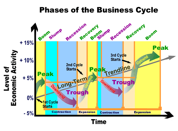 The economy goes through boom-and-bust (recovery-and-recession)
business cycles.
The stock market leads (anticipates) the current economic trend
(a Bull Market actually begins before the current Economic Cycle bottoms out; refer to the figure on the right).
Notice that the stock market tops well before the economy tops
because the market is forward looking, and the economic data is backwards looking.
Economically sensitive issues, like stocks and corporate bonds, do better in times of economic expansion
(beginning with Early Recovery);
and defensive issues, like government bonds, do better in times of economic contraction.
The economy goes through boom-and-bust (recovery-and-recession)
business cycles.
The stock market leads (anticipates) the current economic trend
(a Bull Market actually begins before the current Economic Cycle bottoms out; refer to the figure on the right).
Notice that the stock market tops well before the economy tops
because the market is forward looking, and the economic data is backwards looking.
Economically sensitive issues, like stocks and corporate bonds, do better in times of economic expansion
(beginning with Early Recovery);
and defensive issues, like government bonds, do better in times of economic contraction.
Current prices reflect the market's collective beliefs about future prices
(i.e., people are willing to buy when they believe the issue
in question will be worth more in the future;
and they will sell when they believe the trade or investment will be worth less in the future).
The best traders are good at anticipating the anticipators.
Please understand that prices have to move — Up, Down, or Sideways. Why?
Wall Street professionals need prices to move
because that's how they make their living.
Bottom line, whenever the market (any market, index or individual issue)
is open for normal trading, prices are generally moving based on any supply and demand imbalance.
Prices move up when demand out strips supply and down when supply overwhelms demand.
Those who believe prices will be higher in the future want to buy that issue
and this creates demand.
These buyers (traders/investors) are called bulls;
and as long as their belief remains bullish and they have buying power (money to invest) for the issue they believe will be higher,
they create price support
because they (any savvy investor) likes to buy at discount prices;
they want to buy on the dips (any pull back in prices).
Their buying can also drive prices higher when they fear prices are moving up, as they predicted,
but without them owning a position,
which creates the up (trend) they are chasing.
The same basic psychology works in the opposite direction too.
Bears are traders/investors who believe prices will be lower in the future and
their selling creates the supply of stock (or whatever issue) they have to sell.
This supply creates price resistance to any bullish rally.
Whenever demand exceeds supply (bulls want to buy more shares than the bears are willing to sell at current prices),
prices will move up;
and whenever supply exceeds demand (bears want to sell more shares than the bulls are willing to buy at current prices),
prices will move down (we'll take a detailed technical look at all this later).
Basically,
prices move up when the majority of currently active traders and investors believe prices will be higher in the future,
prices move down when the market (that same group of traders and investors) believe prices will be lower in the future,
and prices move sideways whenever there is broad indecision or satisfaction with the current price range.
Because price trends work with a positive feedback mechanism, they are by nature, a self-fulfilling price patterns
that can drive prices to unsustainable extremes, which will cause that trend to reverse.
But within each trend, there is a fair amount of random buying and selling; and
these seemingly random movements (market noise) can also create recognizable patterns,
patterns that move in amazingly predictable ways that can often foretell the direction of short term price trends.
Those who know these patterns and can recognize their early development have a trading edge;
and when a pattern fails,
the odds favor a sharp move in the opposite direction,
which can be another trading edge to those who understand this secondary aspect of trading patterns.
These market price movements tend to boil down to one of four patterns: Trusting, Retracing, Pivoting, and Basing.
Let's take a quick look at each price pattern now (we'll explore all this in greater detail later):
The following figure is of an idealized line chart that
was in a primary up trend that then started to base out.
Each of the four basic price patterns is labeled.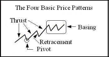
- Trusting Pattern
- A Trust is normal, often abrupt, movement in the direction of the broader market trend.
Stocks in a healthy trend (those that are likely to continue) tend to make a kind of two-steps forward, one-step backwards move
(refer to the figure "The Four Basic Price Patterns").
A trust is the two-steps forward part of that move.
A move in the direction of the trend can actually be any number of steps, sometimes just one big step (move) or as many as 13 or so little steps;
but most of the time it's 3 to 5 average steps (or bars on a bar chart).
- Retracing Pattern
- A Retracement is a normal counter trend movement that is also known as Profit Taking, a Pull-Back or a Draw Down.
As you may have guessed, the retracement is the one-step backwards move.
- Pivoting Pattern
- A Pivot is a normal trend reversal.
A pivot is a change from a trusting move to a retracing move or visa-versa,
which looks like a V or Λ pattern on a chart.
Prices can only move so far in one direction before they must reverse or take a rest.
The big question associated with every pivot is,
"Is this pivot a (big) primary trend reversal change or
just another minor transition from a two-steps forward to one-step backwards move or visa-versa?"
We'll address the answer to this question later, after we've learned more about the market's nature.
- Basing Pattern
- A Base is a sideways consolidation pattern.
It is a normal rest condition.
Whenever prices are basing, the trend will tend to be sideways,
which can be tight and smooth or wide and choppy.
A base (a.k.a., a consolidation, a price range, channel or band) is quite often the most common pattern,
caused by random buy and sell orders hitting the market,
while traders and investors wait for the next trust to drive prices out of the base.
All this jockeying for position is relative to the participant's time horizon.
Traders have a relatively short time horizon and investors tend to have a longer time horizon;
but both groups want to buy low and sell high.
What appears high to a trader might be low to an investor,
who simply needed to see some evidence of a developing up trend before being willing to commit capital.
So, these four pricing patterns can actually occur simultaneously in multiple time frames.
This means that we can (should) analyze the market in multiple time frames.
We can do our analysis on a daily basis, a weekly basis.
We can even do it on a monthly, quarterly, or yearly basis,
but these time frames tend to be too long for most practical trading purposes.
We can also analyze the market on any arbitrary number of intraday time slices too;
the most common intraday time frames used by professional traders are hourly, 15-minute, 5-minute and 1- or 2-minute slices.
What can be confusing to most traders is the fact that prices can be basing in one time frame, retracing in another,
and trusting in yet another time;
and that all major trend reversal start in the shorter time frame,
and therein lies the predicament - is this short-term move the start of something big
or is it just another minor retracement in the longer term trend.
The key is to keep your eye on the longer time frames,
as the price action in that time frame is very likely to eventually drive the action in the shorter (quicker) time frame
until that longer term time frame is clearly overdone relative to the underling fundaments.
In the long-run, prices are driven by fundamental factors.
But in the short-run, prices are driven by technical factors.
Ultimately, prices are driven by supply and demand imbalances; and
if prices will not move, due to a normal news driven supply and demand imbalance,
professional traders will create reasons (they have lots of little tricks) to simulate a supply and demand imbalance,
which is likely to favor their position (e.g., They'll talk their book).
Prices (ticks or prints on the ticker tape) move up when buyers (the bulls,
who profit from rising prices) are demanding to buy more stock than
the sellers (the bears, who profit from falling prices) are willing to sell (supply) at this time;
and price move down when the bears sell (supply) more stock than the bulls are willing to buy (demand) at this time.
There are times when one group (either the bulls or the bears) are clearly dominating the price action
and there are times when neither group can sustain the upper hand.
Whenever it appears that one group (the bulls or the bears) will be dominate,
professional traders, who don't really care which way the market moves, so long as it moves,
will jump in and thus propel that move, thus creating a trust, into the next pivot,
which is caused by professional traders locking in a quick, short-term profit.
The best way to make and keep your capital
is to keep your operations in-synch with the broader market trend —
when one of the two groups is dominate, act like a pro and trade with that group,
and when that group loses its dominance, close your position and wait/look for the next clearly trending market or individual issue.
In the short-run, the market is a voting machine –
people buy what they like and sell (or discard) what they don't.
This is how most people operate (in every aspect of their lives),
most are driven by their emotions (e.g., hope, fear, and greed) and the opinions of others.
It is this behavior that can drive prices to irrational extremes.
In many ways, the market is like high school, where everyone wants to be in the popular crowd and tends to subscribe to popular wisdom.
The true nature of the market is a mystery to most retail investors.
They hear others are making money and they want some too;
but most are not willing to invest the time, effort and capital required to become proficient.
They hear a good news story and buy an investment, hoping that they too will make money.
But like most investments that are capable of yielding better than inflation rates of return,
their value fluctuates up and down;
and at some point it is likely to be underwater (experience a drawdown).
They then hear some bad news and sell the investment to avoid future losses.
But what most fail to understand is that you can't make much, if any, money taking your buy and sell signals from others.
The retail investor is generally the last to hear the news or read an investment report.
Even if they were the first to get the news or good investment advice, it is still too late,
because Wall Street likes to play, "Buy the Rumor and Sell the News."
The pros know how to read the tape and can tell when something is up.
Given that human nature is what-it-is,
we all try to exploit our information edge,
and this can be seen in a security's price action – the tape,
which is a historic record of all trades and can be analyzed
(e.g., the data can be plotted graphically on a price/volume chart).
If you want to be a successful investor,
you'll have to develop the ability to generate your own buy and sell signals,
which means you'll have to learn to do your own research.
You'll also have to learn how to develop, maintain, and follow a trading/investing plan;
using a plan is the only sure-fire technique known to control our emotions while in the market.
(But don't worry, it's not that hard —
you don't have to know everything, just enough to be successful and I'm giving you much of the basic operational knowledge in this paper.
I'm also giving you a great set of references at the end of this paper.)
In the long-run, the market is a weighing machine – prices track the economic prospects for the underlying business(es).
But in the meantime, prices are often trapped in a trading range,
which reflects the market's collective view of fair value
(buyers want to pay as little as possible and sellers want as much as possible, and
assuming no duress, trades tend to occur at prices considered relatively fair by each reasonably informed party).
The trend, up, down or sideways, of this trading range will ultimately follow the growth rate trend of the underlying business,
which in turn follows the boom and bust cycles of the broader growth-biased economy,
(i.e., the business cycle).
In boom times, the economy expands and the value of most assets trend up;
and when the economy contracts (bust) the value of most assets trend down.
It's not too hard for the average investor to profit from this growth-biased story.
In fact, it's basically what investing is all about.
But you can do better.
You can learn to trade like a professional "Value Investor" and earn an above market average rate of return over the long run.
The key is to be a buyer when prices are trading at the lower-end of this longer-term trading range
and a seller when prices are in the upper-end of this trading range,
to only own investments that are very likely to survive the market's boom and bust cycles,
and, ideally, investments that will pay you an income while you wait for your capital gain.
Trading Vs. Investing
Trading is a short-term market activity,
where the participants compete for their share of a fixed size pie.
Some have called it a zero-sum game, because winners take from the losers.
In fact, it is actually a minus-sum game, because the market functionaries earn a little on each trade.
For the sake of this discussion,
I'll break the market down into four main groups: Bulls, Bears, Uncommitted Traders, and the Market Facilitators.
Bulls are committed buyers, bears are committed sellers,
uncommitted traders are for the most part professional day traders who are ready to take advantage of any short-term opportunity the market presents,
and those that facilitate the other three groups and make money at their expense (e.g., Market Makers, Brokers & Exchanges).
The trader's edge is their ability to keep abreast of market developments via technical analysis,
to keep their operations in-synch with the broader market trend,
their ability to develop a rational trading plan, and
their ability to trade that plan.
Investing is a longer-term market activity.
It's all about owning securities that are likely to grow and be worth more in the future
and that should be paying the investor short-term income to hold while they wait for their long-term capital gain.
The investor's edge is based on the strong fundamental factors of the underlying business(es);
and all businesses are affected by the biggest fundamental factor of all — our economy.
Please note that we all (individuals, businesses and governments) perpetuate our growth biased economy.
But the economy naturally goes through boom and bust business cycles,
which causes both expansion and contraction in the economy,
and thus increases or decreases in the value of our investments in the underlying assets.
Note that these boom and bust cycles are mainly caused by the fact that we all tend to do the same thing at the same time —
when times are good, we all want in, and when times are bad, we all want out,
which drives these expansion and contraction cycles.
Fortunately for most investors,
the economy expands a lot more than it contracts.
Successful investors need to keep their operations in-synch with the emerging phase of the business cycle.
I like to watch ECRB's Recession-Recovery Watch.
Consider reading "Beating the Business Cycle: How to Predict and Profit from Turning Points in the Economy"
by Lakshman Achuthan and Anirvan Banerji.
Thus, the investor's biggest edge is being in the stock market while the economy is expanding and in cash or government debt while it's contracting.
If you can't even keep up with this level of investment research,
consider simply just Dollar-Cost Averaging into a
broadly diversified stock index fund like Vanguard's
S&P 500 Index Fund (symbol: VFINX) or Total Stock Market Index Fund (VTSMX).
Historically speaking,
dollar-cost averaging into a broadly diversified investment has always (to date) yielded respectable risk-adjusted returns over time —
it's a time proven technique to grow wealth in a growth biased economy
that goes through natural boom and bust cycles.
Traders, both professionals and armatures alike,
create, perpetuate, and even drive trends to irrational extremes,
because they are taught or figure out for themselves that the best (easiest) way to make money in the market is to trade with the trend,
which is yet another example of being all in when times are good and all out when times are bad.
However, it is the big fundamentally based, value fund managers that cause market tops and bottoms.
These huge portfolio managers, use these extremes to accumulate and distribute the large positions that they manage;
and because of their size and their investment horizon (time frame),
they can afford to wait for the traders and the economy to work through their normal boom and bust cycle extremes.
Note that money tends to flow to the best money managers and
these guys tend to manage the largest portfolios, and
thus are best able to hire or grow some of the best teams of proprietary analysts and traders.
Generally speaking,
it is easier to earn money as a reasonably diversified investor than it is to earn a living as a trader.
This is generally due to the fact that traders are competing against professional day traders;
however, a properly prepared individual investor is competing against large institutional fund managers who
are slow to act because of their size; and because of their size,
it is easy to see the trends and support and resistance levels that they create (more on this later).
Fundament Analysis Vs. Technical Analysis
Fundamental Analysis
is the examination of the underlying forces that affect the wellbeing of the economy, industry groups, and companies.
As with most analysis, the goal is to derive a profitable forecast of future price movements.
Over the years I've learned a lot about Fundament Analysis
(clink here for a valuable perspective on value investing); but here, I'll only share the following points:
- In the long-run, the fundamentals will drive the longer-term price action;
and that's why professional investors buy or do their own fundamental analysis.
- Fundamental analysis is often based on public information that is old, sometimes very old,
and that this information almost always seems to get priced into the market long before the information gets disseminated to the public,
because those with access to non-public information will often try to exploit their information edge
(once again, consider the old saw, "Buy the rumor, and sell the news.").
- We can't always rely on what other people say about the fundamental story because people are naturally conflicted.
But no matter what people say, they will inevitably buy or sell in favor of their best interest;
and this activity can be seen on the Tape.
- The fundamentals always look best at a market top and the worst at a market bottom.
When prices fail to make a new high on new good news,
it's time to get out or get short.
And when prices fail to make a new low on new bad news,
it's time to get long.
In summary, the market is forward looking (anticipatory) —
current prices reflect the market's collective view of expected future value,
based on all that is known or believed to be known about future profit reports,
which are in turn based on current fundamental factors.
But when future profit reports "Hit the Tape";
(Wall Street speak for the dissemination of public information),
current prices will jump to correct any misperception about the fundamental facts.
Technical Analysis
is based on an examination of current and past price movements in an attempt to forecast future price movements.
Like weather forecasting, technical analysis does not result in absolute predictions about the future.
Instead, technical analysis can help traders and investors anticipate what is "likely" to happen to prices over time;
and that's why traders use a "Stop-Loss" to protect their capital when things do not trade as expected.
Learning to "Read the Tape" is a skill that pays handsome dividends;
and all professional traders are at least amateur technicians.
Therefore, the following perspective is based strictly on Technical Analysis in
an attempt to better anticipate the anticipatory nature of the market.
But first we must learn a little bit about the mechanics of making a trade.
The Anatomy of a Trade
Trading Orders
There are two basic order types used to initiate a trade.
The first and simplest is a Market Order,
which requires the ticker symbol of the stock to trade, the number of shares to be traded, and type of trade — buy or sell.
For example, "Buy 100 GE at the Market", which says you want to buy 100 shares of the company's stock
whose ticker symbol is GE at the best available price ASAP.
A market order will guarantee a fill, but not a favorable price.
A fill is another name for a completed trade, as in "Your order was filled!"
The other basic order type is a Limit Order,
which requires everything a market order requires, plus a limit price,
which specifies the most you are willing to pay for a stock or the least you are willing to accept for your shares.
For example, "Sell 100 GE limit at $35.97", which says you are willing to sell 100 shares of GE if you can get $35.97 or more for your shares.
A Limit Order does not guarantee a fill, but it does guarantee a favorable price — the opposite of a Market Order.
If a Limit Order cannot be immediately filled,
it is added to the Central Limit Order Book
(CLOB, which can be seen in a Level II quote, like for ticker QQQQ below on the left).
There are a number of more advanced order types.
Let's consider a few of these because they can be valuable tools in your trading toolbox;
but understand that not all brokers support these exactly the same, and some not at all.
Refer to your broker's trading system help for details about the trading tools available to you.
The most common is called a Stop Order;
it is generally used to activate one of the two basic orders addressed above when the market (see Level I quote below) reaches the specified price.
For example, "Sell Stop 100 GE at $34.87, at the Market", which says if GE trades down to $34.87, sell my 100 shares at the best available price;
and is the type of order a trader could use to exit a Long (Bullish) Position —
a traditional Buy to Open position followed by a Sell to Close that position.
Another example, "Buy Stop 100 GE at $35.02, Limit $35.05",
which says if GE trades up to $35.02, buy 100 shares at the best available price at or below $35.05;
and is the type of order a trader could use to exit a Short (Bearish) Position —
a position that was opened by first borrowing some shares from your broker and then selling these to the market short in anticipation of prices going down,
and at some later point these shares must be bought back to cover the loan from your broker.
A Stop Order can also be used to enter a break-out or break-down trade
(see Support and Resistance Channels below).
(Also, contrary to the Stop - Limit order example above,
it is always best to use a Stop - Market order to exit a failed trade;
and as a general rule,
it's best to use some type of Limit order to enter a position,
because it's always better to miss a trade because you could not get a favorable price,
than to have a position with an unfavorable Cost Basis.
So, the Stop-Limit order above is actually a better example of the type of order
you might use to enter a new position in a bullish stock just as it starts to rally.)
Another very useful, advanced order type is Order Cancel Order (OCO) (a.k.a. a Range Order).
An OCO allows you to have two active orders against just one open position.
Let's consider the most common example of an Order Cancel Order.
Let's say you are long 100 shares of GE at $35.03, with support down to $34.9 and resistance up at $36.00 (more on support and resistance later).
So, you believe it should rally to $35.97 and if it does goes there you'll take a profit.
However, if the stock drops to $34.87, your plan is to stop out, because that violates current support.
An OCO allows you to program this plan into your system, so you don't have to watch it;
and when either one of the two exits order is hit (filled),
the system automatically cancels the other order.
The last advanced order I'd like to address is Order Sends Order (OSO).
In a way, it's like the Stop, Limit Order above — it's an order with two part;
and when if the first part happens (gets filled), the second part of the order becomes active.
The basic ideas is,
if the first part of your OSO order gets filled (e.g., Buy 100 GE Limit $35.01) and that order has the OSO flag checked
(or whatever your broker uses to indicate this order is an OSO type),
then the system will automatically send another order,
which was programmed at the time the initial order was created.
Using/extending the prior OCO example above,
let say you want to buy GE near support and sell it into resistance, with a stop below support.
We can use an OSO and an OCO to accomplish this trading plan.
Program the system to Buy 100 GE Limit at $35.01 (OSO is checked),
which causes the system to prompt for the second part of that OSO order.
In that second part,
you enter an OCO to exit (with a profit) if GE rallies to $35.97 or to exit (with a small loss) if GE sells off to $34.87.
I know all this is a little advanced; but learning to master your broker's tools can become a profitable skill to own.
How the Market Advertises Prices Quotes and Records Trades
The market quotes two prices for every tradable security.
The difference between these two prices is called the Spread.
The first and lowest of the two is called the Bid
and is the current best (highest) price the market (some trader or investor) is willing to pay
for the issue (the security) being quoted.
The second and higher of the two prices is called the Ask or Offer
and is the best (lowest) price the market is willing to take for that security.
This basic quote is called the National Best Bid and Offer (NBBO).
It is also known as a Level I quote
and is sometimes referred to as "The Market"
(e.g., "What's the market for XYZ?" and the spoken answer would be "The Offer price over the Asking price.").
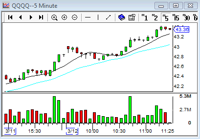
The top of the following graphic (on the left) shows a Level I quote (43.35 - 43.36) for the ticker QQQQ – the Nasdaq-100 Trust ETF
(this ticker is now QQQ and was changed after these pics were taken).
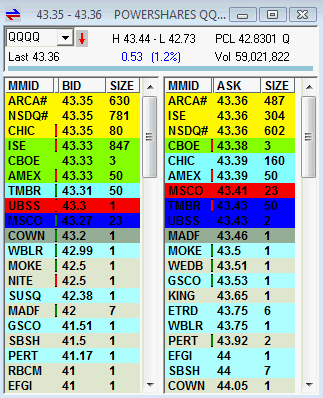 The market can also provide a Level II quote,
which show the sum of all the limit orders waiting to be filled — the Limit Order Book.
Let's take a closer look at this graphic.
Just below the Level I quote in the title bar of the figure is the following information:
The market can also provide a Level II quote,
which show the sum of all the limit orders waiting to be filled — the Limit Order Book.
Let's take a closer look at this graphic.
Just below the Level I quote in the title bar of the figure is the following information:
- Name (ticker) of the security — QQQQ
- The state of the last tick (trade) — Red down arrow indicates a trade on the Bid and green up arrow indicates the Ask.
- The current highest price of the day — H 43.44
- The current lowest price of the day — L 42.73
- The prior closing price — PCL 42.8321
- The exchange this issues trades on — Q for NASDAQ and N for NYSE
- An anchor, which is not part of a normal Level II quote; but is used by this trading platform to link this display with a chart.
- The current price associated with the last trade — Last 43.36
- The numeric and percentage difference since yesterday's closing price — 0.53 (1.2%)
- The number of shares already traded today — Vol 59,021,822
Below all this and the largest part of the figure is the current Limit Order Book for the ticker QQQQ.
On the left we see the aggregated list of buyers and on the right we see aggregated list of sellers.
The top of these two lists is a detailed view of the Level I quote summarized at the top —
Note that Bid prices run from highest (best) price at the top of a list of successively lower prices,
and that Ask prices run from lowest (best) price at the top of a list of successively higher prices.
Each list is divided into three columns (there is actually even more information that can be displayed,
but which is not needed for most normally trading),
where we see in each row the Market Maker's ID
or ECN's ID, the price quote,
and the total number of Lots (100 shares) available at that price.
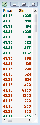
Every time a trade is executed (filled),
the specifics are recorded ("Printed")
on the Ticker Tape or just the "Tape",
which is also known as "Time & Sales" information.
The following details are recorded on the Tape:
the ticker symbol,
date and time of the trade,
the location of the trade,
number of shares traded, and
the price of that trade.
These details are all part of the legal public record, which can be filtered and viewed by any interested party
(e.g., like on the CNBC Real-Time Ticker).
The only details not recorded on the public record are the names of traders and their brokers;
these are recorded on a private record for regulators and exchange managers to use in their oversight activities.
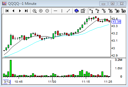
Let's consider the associated Time and Sales window for our QQQQ example above
(refer to the figure on the right),
which shows only the price and quantity of each trade
(this user configurable window can display any of the other related circumstances associated with each trade).
The top print is of the last trade and the one below that was of the prior trade and so on back in time (history).
Green prints indicate that the trade took place on the Ask
(the Buyer used a Market Order or a fillable Limit Order to force the trade)
and red prints indicate that the trade took place on the Bid
(the Seller forced the trade).
In this case we see scrolling off the bottom of the screen a single trade of 100 shares at the Asking price of $43.37.
Just after that,
starting with the 300 share trade just above that $43.37 print,
we see a number of Market Orders (and/or fillable Limit Orders) to sell at the Bid price of $43.36,
then we see the color change from red to green without the price changing,
which means a large number of new Limit orders to sell at $43.36 are being paired off by
a large number of new Market orders to buy,
which tends to indicate prices that were going down are now likely to move up next.
Reading the Tape like this is hard because there is some much data to process and
because there is so much noise in the real time data.
Fortunately, there is a better way.
The information displayed on the Tape (Time & Sales Window) can also be analyzed graphically.
We can divide (aggregate) the stream of data into any arbitrary (equal) time sample or timeframes
(e.g., Weekly, Daily, Hourly, 15-Minute, etc.)
and graph the information on two axes, where price is graphed on the vertical axis and time on the horizontal axis.
We can also display a histogram of the volume (quantity) traded in the sample,
and color the volume bars based on whether the majority of trades were place on the Bid or Ask.
Each sample can be aggregated into a varying line indicating the last price in each sample
(e.g., the two idealized line charts below, which show an Up Trend and a Down Trend) or
into bars that display the highest (top of the bar), lowest (low of the bar),
first or opening price (a small horizontal extension on the left of the bar),
and the last or closing price (a small horizontal extension on the right) for that sample of time.
I prefer Candle Stick Charts
because they make it easier to also see who is winning the battle between the bulls and bears.
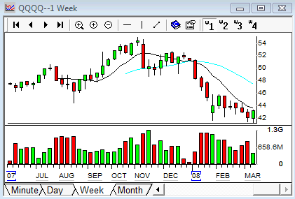
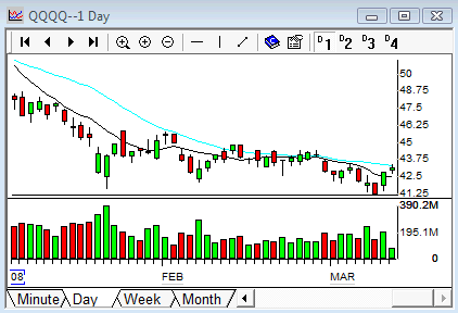
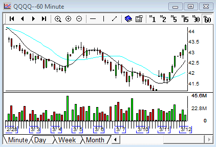
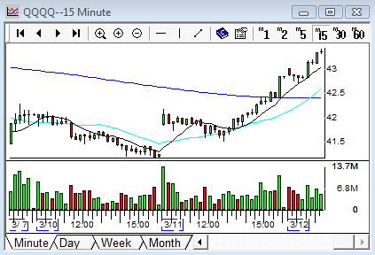
Let's now take a multiple timeframe look at the tape for the ticker symbol QQQQ (the NASDAQ-100 ETF),
that we've been looking at above.
Notice that each subsequent chart is a finer (more detailed) look at the very same data;
and if we were watching these charts in real-time while the market was open,
the shorter-term charts would appear to be subject to much greater volatility than the longer-term charts
because they are generating new bars at a greater rate because the sample period is smaller.
But if you look closely,
the same information is being displayed on each chart as each new tick (trade) is aggregated into the current bar
developing on the hard right edge of each chart.
The only real difference is the amount of summary information displayed.
Note that the longer-term charts look further back in time.
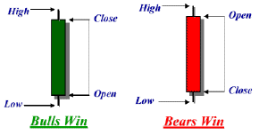
Candle Sticks
The basic
candle stick
(bar on a price chart like those above)
is one of many equal aggregations of time
of all the trades recorded on the Ticker Tape
for the symbol being studied in that interval of time
(e.g., each bar is equal to one Month, Week, a Day, an Hour, a Minute or whatever the user set the chart's timeframe to).
My ideal candlestick bar is colored
(i.e., the body is either green or red, like in the charts above).
Some candle chart systems use open or clear bars instead of green bars,
and black or solid bars instead of red bars;
and most charting systems allow the user to set the style and color
based on their personal preference.
The body is the wide part of the bar
(refer to the pictures below),
and the candle wicks are the lines, shadows or tails above and below the body.
Each candle provides five bits of information about that sample period —
the Open (first tick or trading price in that sample of time),
High (highest price), Low (lowest price), Close (last trading price in that sampling),
and who (the Bulls or the Bears) won or are winning that bar.
Generally speaking,
when the candle body is green the Bulls are winning,
and when the bar is red the Bears are in charge.
Green bars have the Opening Price
(the bottom of the candle body) below the Closing Price
(the top of the candle body);
red bars are reversed with the Opening Price at the top of the candle body and the Closing Price at the bottom.
The top wick indicates the highest trading price seen in that sample period,
and the bottom wick indicates the lowest price.
Candles make is easy to see whether the Bulls or Bears are more aggressive
(using Market Orders to drive prices higher or lower).
But it's actually not that simple.
We have to take a look at the shape, size, the color each candle, and the associated volume
(generally below the bar)
as the candle stick bar pattern evolves, bar-after-bar, over time to know which group is currently dominating the price action
and which is like to dominate next.
This information is very important because the last group (bulls or bears) driving the price action is very likely to be the dominate group
in the next sample or bar too; and this is important because the easiest way to make money in the market is to trade with the dominate group,
until that group has pushed the current trend too far
(more on this to come).
There are thirteen basic candle stick configurations and each says something about the group that is dominating the current price action.
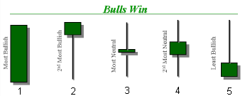
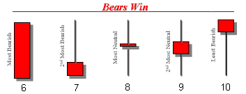
Bar number 1 is very bullish. From the open to the close, the bulls dominated the price action.
Whenever you see a bar like this, it's safe to assume the next bar will be green too or at least start out bullish.
Bar 6 is the exact opposite.
From open to close, the bears were in control; and this bar is very likely to yield another red bar. Bars number 2, 10, and 13 are very bullish.
The bears started out in control; but the bulls were able to fight back and recover most (bar 10), all (13), or more than they lost (2).
Don't be fooled by the color (e.g., bar 10), which is just half the story;
the shape of the bar tells the rest of the story and in this case, it's all about the big lower candle wick or tail.
It's this "Bottoming Tail" that is the important thing to see in these bars,
which is defined by the fact that the lower wick or shadow of the candle is two-thirds or more of the total range or vertical size.
Once again, the next bar should start out bullish. Bars 5, 7, and 12 are the exact opposite.
They are very bearish. The "Topping Tail" is the important thing to see in these bars.
In this case the bulls started out in control only to give it all back to the bears — the current dominate group;
and here again, we should expect the next bar to be red or at least start out red.
These candles with long tails can also be called "Pivots" because they identify trend reversals,
especially when they are accompanied by larger than average volume.
Bars 3, 4, 8, 9, and 11 are neutral with both sides in a state of equilibrium.
When these bars have a very narrow range between the top (the high) and bottom (the low)
when compared to the average range bar,
they are called narrow range bars
and tend to yield an explosive moves up or down after a period of basing
(a move sideways).
Here's a link to more information on how to use Japanese Candles.
Here's a link to some additional information on Chart Analysis.
Supply and Demand
Prices trade up and down, based on supply and demand imbalances.
Supply is created by sellers — the bears, who are rewarded when prices go down.
Demand is created by buyers — the bulls, who are rewarded when prices go up.
When the current demand (orders to buy — market orders and fillable limit orders) exceeds the available supply
(sum of all limit orders to sell at the current best price), prices naturally tick up to be filled at the next available price quoted
in the Limit Order Book (see Level II above);
and when the current supply (orders to sell — both market orders and fillable limit orders) exceeds the available demand,
prices naturally tick down the limit order book.
Recall from above, a market order to sell is always filled at the best available price (the highest Bid) and
a market order to buy is always filled at the best available Ask.
Eager and anxious traders/investors prefer market orders because that order type is guaranteed to be filled.
And when a burst of market orders to buy hit the exchange — a jump in demand,
prices tend to rise (trust up) as those orders consume available supply in the limit order book;
and when a burst of market orders to sell hit the market — a jump in supply,
prices tend to fall (trust down) as those order consume available demand in the limit order book.
Any imbalance that causes a trust up or down attracts the attention of other bulls or bears
who have been waiting for a price move to exploit.
What happens next — the trust begins a new trend or continues the current trend or is reversed to create a pivot —
is a function of any supply and demand balance or imbalance that is sustained over a period of time.
If the imbalance persists, the trend will continue;
but if the temporary imbalance is met by the opposing force,
a base is created or perpetuated.
Note that prices tend to spend a lot of the time trapped in a price range
(a.k.a., a Base, a Sideways Consolidation Pattern, a Support and Resistance Channel).
Support and Resistance Channels
Prices trade up and down within a Support and Resistance (S/R) channel (a.k.a. a base, band or price range) —
a trading range that reflects the current market's collective perception of fair value.
Buyers naturally want to pay as little as possible for their desired stock, and sellers want as much as possible for their available stock.
It's this naturally tendency that creates the S/R channel — when prices trust up or base near the upper edge of this channel,
savvy market participants step in to sell at premium prices, thus creating excess supply —
the upside resistance that tends to overpower any bullish buying pressure and
often causes an upward trust to reverse to the downside, thus creating a pivot;
and when prices trust down or base near the lower edge of this channel, savvy market participants step in to buy at discount prices,
thus creating excess demand — the support that tends to overpower any bearish selling pressure and often causes down trends to reverse back to the upside,
thus creating another pivot.
Savvy bulls know they'll make money when they buy low and sell high;
and savvy bears know that they'll make money when they sell (short) high and buy (to cover) low.
It's this professional activity that tends to cause prices to trend up and down within the current price channel,
which can be in an up, down or sideway trend.
These price channels actually exist in multiple time frames and can be seen in charts of the same issue over different periods
(e.g., hourly, daily, and weekly — like the charts of QQQQ above), just as fractals generate similar patterns within similar patterns etc.
Channels in shorter time frames (e.g., a 15-min bar chart) are smaller than channels in longer time frames (e.g., a daily chart)
because adding time also adds participation and uncertainty.
Larger portfolio managers tend to operate in longer time frames because it takes time to adjust their larger positions
without adversely impact the price of their trade; and when these elephants fail to take the time needed,
their market operations tend to greatly distort the current S/R channel;
but when their operations complete, the prior size and shape of the channel tends to be restored.
News and commentary can cause these channels to shift horizontally up or down —
thus converting prior resistance to support or prior support into resistance.
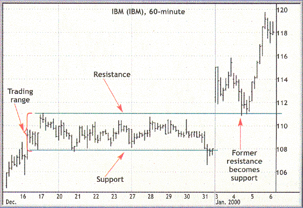
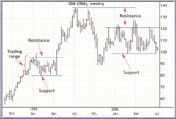
Consider the following two charts of IBM which show support and resistance channels existing simultaneously in two different time frames.
Each vertical bar shows the range of prices (high & low) in each time period (60-minutes in the first chart and each week in the second chart);
and the left notch indicates the initial (opening) price, and the right notch shows the final (closing) price.
See how prices trade up and down within the channel and how pivots define the range of each support and resistance channel.
This price range is the market's collective view of fair value in the time frame being examined.
To improve the odds of success and to minimize risk, you want to buy support
(at discount level prices) and sell resistance (premium prices), like the pros.
Refer to Support and Resistance, Part 1 of 2 and
Support and Resistance, Part 2 of 2 for additional information on the subject.
Price Trends and Moving Averages
Traders and investors create and perpetuate trends; and if you want to make money and keep it,
it's best to keep your operation in-synch with the broader market trend as indicated by the major market indices (e.g., S&P 500)
and the 20 period simple Moving Average (MA) on your primary trading time frame (e.g., 5-minute) and also on the next longer time frame (e.g., 15-minute).
Remember: No trends, No trade!
There are times when the trend is unclear (e.g., in a basing pattern).
At these times, it's best to check the next longer time frame or just sit on your hands while you wait for the market to side with the bulls or the bears.
But most of the time, there is a broader market trend;
and a stock or index in motion (trending) is very likely to continue (trending) in the same direction
until a location and/or event combination changes that direction, thus creating a pivot.
Locations are Support and Resistance (S/R) levels.
Events include: news and commentary, climatic (near vertical) price action, and
intraday reversal times (9:35, 10:00, 10:30, 11:15, 12:00, 1:30, 2:15, 3:00 & 3:30).
If not being driven by specific news, individual stock prices will trade with the broader market averages (e.g., S&P 500 Index).
But healthy price trends (i.e., those that are likely to continue) almost never move in a straight line up or down —
they tend to move in a two-steps forward, one-step back pattern, with more volume on the advancements and less on the retracements.
In an up trend, prices tend to advance into near-term resistance, retrace back into near-term support, and then rally through that resistance level,
thus converting that level into the next likely near-term support level; and the inverse process takes place in down trends.
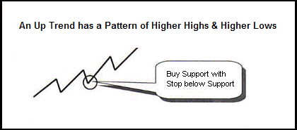
Consider the following idealized line charts:
|
Notice the pattern of higher pivot highs and higher pivot lows, thus defining an up trend; and when the trend is up like this,
Be Bullish and look for a Buy Setup — buy a bounce off support in the dips (pivot low) with a stop-loss just below support;
and then sell a bounce off resistance (pivot high) in the subsequent rally to earn a capital gains profit.
But when prices fail to make a higher pivot high, look for the trend to reverse with a lower pivot low as the first sign of a new down trend,
which will be confirmed by a new lower low.
An up trend can also be reversed by a high volume, near-vertical move up quickly followed by a snap reversal move down.
Refer to What is a Trend, Part 1 of 2
and
What is a Trend, Part 2 of 2 for additional information on the subject.
|
|
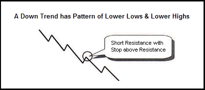
A down trend is defined as a sequence of lower pivot lows and lower pivot highs; and when the trend is down like this one,
Be Bearish and look for a Sell Setup — sell short a bounce off resistance with your stop-loss just above resistance
and then buy to cover a subsequent bounce off support to earn capital gains.
But when price fail to make a new lower pivot low, look for a trend reversal, which will be confirmed by a new higher pivot high.
A down trend can also be reversed by a high volume, near-vertical move down quickly followed by a snap reversal move up.
|
Prices do not always move in this nice two-steps forward, one-step backwards pattern.
Often they'll just choppy around in a wide, sloppy base.
Look for and, if necessary, wait for, this pattern to develop.
VCM's Training Room Moderator Dan likes to say,
"If it ain't got that swing, it don't mean at thing —
It's just market noise that'll chop-up your trading account into worth-less pieces."
Price Trend Laws:
- The primary (longer-term) trend is very likely to continue, until it's clearly over done (i.e., fundamentals cannot support that rate of change).
- The best trends (i.e., those that have the best odds of becoming a profitable trade) tend to advance (trust) in a sequence of about 3 to 5 bars,
then retrace (pull-back) for about 1 to 3 bars, and then once again resume in the primary direction for another 3 to 5 bars or so
("they've got that swing").
- If a stock fails to make a higher high while in an up trend, it is likely to make a lower low (the trend will reverse);
and in a down trend, if the stock fails to make a lower low, it is likely make a higher high.
- Trends that advance with many more than 5 bars in a row or advance with a very wide range bar tend to be exhaustion moves that
cause primary trend reversals.
- The market tends to cycle between active periods of thrusting and retracing (big moves up or down) and basing (restful pauses).
Popular Moving Averages:
Most professional day-traders use the 8-, 20- & 200-period simple Moving Averages (MA) on all of their charts.
Plus, on the daily chart they also add the 50-period MA,
and on the weekly they use a 10- & 40-period MA as these are the same as the 50 & 200 on the daily chart.
Most big institutional portfolio managers use the 50- & 200-day moving averages.
It pays to know what professional traders and the large portfolio managers are seeing
because when these elephants decide to make an adjustment to their portfolio prices trends will be impacted.
Except for the fact that these moving averages are popular, there is nothing special about them.
However, because they are popular and because these moving average tend to create support when prices are above
and resistance when prices are below these average, you should have them on your charts too.
Volume's Tell on Trusting, Retracing, Pivoting, and Basing
As a general rule,
we tend to see a little more (average to slightly above average) volume on bars that support the direction of the primary trend (trusts)
and a little less on bars that retrace;
and a lot more volume on bars that create primary trend reversal pivots.
- Trust
- A trust is a normal movement in the direction of the broader (primary) market trend.
Whenever prices are trusting, we'll tend to see above average volume (more shares trading hands)
as more people want to jump onto the bandwagon.
- Retracement
- A retracement is a normal counter trend movement.
Whenever prices are retracing, we'll tend to see below average volume
as most people are willing to hold on for the bigger move.
Please note that if you are expecting below average volume
and you start to see above average volume,
this is not a retracement,
it is a trust in a new direction;
and you are probably on the wrong side of this move,
it is best to close, step back, and re-evaluate the market.
- Pivot
-
 A pivot is a V or Λ like reversal pattern.
In a healthy (meaning: likely to continue) up trend, we see a pivot pattern of higher-highs and higher-lows
(like in the Up Trend line chart above);
and in a healthy down trend, we see a pivot pattern of lower-highs and lower-lows.
A pivot is a V or Λ like reversal pattern.
In a healthy (meaning: likely to continue) up trend, we see a pivot pattern of higher-highs and higher-lows
(like in the Up Trend line chart above);
and in a healthy down trend, we see a pivot pattern of lower-highs and lower-lows.
(Yes, I am repeating some of this, because it is very important and because I'm coloring in more detail!)
When prices have been in an up trend, but fail to make a new higher-high, this puts the up trend in question —
"Are we starting a retracement or is this a primary trend reversal?".
If we then make a new lower-low, we can assume that the primary trend has reversed.
When this occurs,
we should see above average volume on the last highest high pivot,
followed by below average volume on the failed attempt to make a new higher-high —
the up leg of this pivot,
which can lead to above average volume on the subsequent downward move or down leg of this pivot.
Primary trend reversals tend to occur after near-vertical price movements — the last one or two bars are longer than average and
are generally sold green (like candle stick bar #1 above) just before the reversal bar (like bars #5, 7 or 12 above).
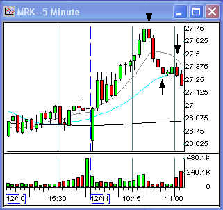
Consider the price and volume pattern in this 5-minute chart of Merck,
which shows a primary up trend to down trend reversal pivot at 10:30 (first black down arrow),
followed by a lower-high pivot at 11:00 (second down arrow).
Let's start on the left end of this chart (the oldest bar) and work our way to the hard, right edge of (or current bar on) this chart.
Going into the close of the prior day, we see rising (S/R) channel.
On the open we see a gap-down (the first trade is way below yesterday's last trade) followed by a 2 green bar rally,
into a low volume base (next 3 bars) as prices consolidate,
then we see a (7 green bars) trust (a breakout) into the 10:30 pivot,
followed by a 4 red bar retracement.
Notice the volume on the trust and retracement.
After the 4 bar drop from the 10:30 pivot,
we hit the rising 20 MA, which provides support and causes another pivot (up arrow about 20 minutes later)
and a low volume rally into resistance at the declining 8 MA,
which is the 11:00 (lower-high) pivot (second down arrow).
Notice the low volume on that last 2 green bar rally and the higher volume on the last two red bars.
- Base
- A base is a sideways consolidation pattern.
Whenever prices are basing in a tight, smooth, low volume pattern near the top (like in the up trending part of the example chart above)
or bottom (for, down trends),
a break of the basing pattern tends to result in a continuation of the prior trend.
However, when the base is wide, sloppy, choppy, and on average volume,
there will often be one or more false breakouts
or breakdowns;
and when the base finally does break, the prior trend tends to reverse.
Note that prices can and often do spend a lot of time in a wide, sloppy base.
Stay away from this pattern.
The odds are not in your favor.
The odds favor the professional market makers who have lots of capital and can afford to scale in and out over time making lots of little profits
while they setup and then fade (trade against) false base breaks,
which is one of their most favorite trading tricks,
which is one reason these wide, sloppy bases are so common.
Refer to How to Handle Consolidations - Part One and
How to Handle Consolidations - Part Two for additional information on the subject.
Some final comments on Trusting, Retracing, Pivoting, and Basing:
Here are some final thoughts on the four basic patterns.
The first few (Trusting, Retracing, Pivoting, and a tight, low-volume Base) are high probability patterns —
they tend to yield favorable (low-risk, high-reward) trading opportunities.
Wide, sloppy, choppy bases occur from time-to-time
and is the default state when none of the other patterns can be identified in the current time frame.
This is a high-energy state of conflict and indecision — neither the bulls nor the bears have the upper hand.
If you are in a position in this market state,
the odds are against you.
It's best to exit and wait on the side lines for one group (the bulls or the bears) to get the upper hand; or
put another way, "No Trend, No Trade!"
There's a fair amount of random noise and irrational trading active in the market,
which creates and perpetuates this wide, sloppy, choppy base — lots of activity, but no real progress.
If you decide to stay in,
pace a hard stop well outside the current base, just in case it does break out hard and against your position.
Note that this basing pattern tends to often make a number of fake channel breaks
(quickly exit the channel for a few trades and then quickly return, thus creating topping or bottom tails that extend out of the channel);
and you may be able to use one of these to exit with a small profit or to minimize your loss.
Bottom line, avoid trading in this confused market state; wait for the market to stabilize and offer up a favorable trading opportunity.
The four basic patterns I've addressed in this paper are known by other names in the popular literature,
plus there are a zillion other patterns known to professional traders and are addressed in this or that book or course.
In my opinion, the names are not important nor are most of those other patterns — it's best to keep it simple.
What is important is your ability to recognize a favorable pattern in real-time
(while the market is trading and these patterns are emerging on the hard, right edge of the chart),
to develop a trading plan while the market is closed (while the market is open, it is hard to remain rational) that allows you to exploit the pattern,
and the discipline and patience to follow the rules laid out in your plan while the market is open.
Relative Strength
Stocks move in groups.
There are major market indices like the Dow Jones Industrials, S&P 500, and Russell 2000, etc.,
which are comprised of similar stocks.
Stocks can also be grouped by their basic business model.
Plus, businesses also have supply-chain relationships.
It can pay to learn these groupings and relationships.
When a group is trending up, some will lead and others will follow or lag.
Leaders have relative strength and laggers have relative weakness.
An issue that has relative weakness in an up trend, will be a good shorting candidate when the trend turns down.
And when the trend is down, the issues that tend to go down least, are good long candidates when the trend turns up.
It pays to know your leaders and laggers.
Refer to Relative Strength, Part 1 of 2 and
Relative Strength, Part 2 of 2 for additional information on the subject.
Putting It All Together
Let's consider the following two charts which show the 20 period MA in cyan (the 8 period is in black and the 200 period in blue).
Notice how these MAs provide support and resistance as price bars trust and retrace.
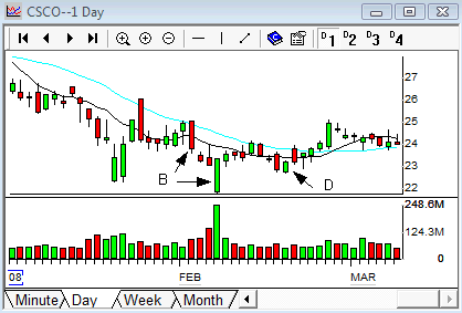
Now let's look at the bottoming tail pivot in February on the weekly chart (Arrow B)
is actually created by the three red bars (on the daily chart) followed by a big volume gap down open that is filled by a big green bar on the daily chart (Arrows B),
which subsequently fails to make a new lower pivot low a few days later, and thus giving a buy signal (D) that leads to a new higher pivot high.
Also note the gap down open (C) to support on the flat blue 200 MA a couple of weeks earlier,
which leads to a gap up open to resistance a couple of days later that fills to create the green topping tail (C),
which signals more downside action to come.
Also notice the high volume trend reversals in November and in February, which are highlighted by arrows A & B.
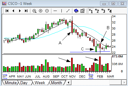
Given this new insight of trending (trusting and retracing) bars within pivoting support and resistance channel, you may want to go back and
reconsider the multi-time frame charts of the Nasdaq-100 Trust (ticker QQQQ) above
or of your own favor stock or index (look for related patterns within patterns).
Learn to read the "Tail of the Tape" or "Message of the Market".
It pays to learn how to read charts!
Some Fundamental Truths About The Market
- Anything can happen.
This is why stops are necessary; and
should be place at the first location that should not be reached if the trade (or investment) is going to work out as expected.
But even if a stop is hit and you are thrown out,
you still have the option to give a trade another chance,
given that the current price actions still suggests that you're looking at a favorable setup.
- All trades need wiggle room.
No one consistently buys the bottom or sells the top.
Every trade needs to be given some degree of drawdown before advancing in the expected direction.
- You don't need to know what is going to happen next in order to make money.
But you do have to be in the market;
and you do need to trade with an edge — one or more things that puts the odds in your favor over the long term.
This is how Vegas casinos make their millions.
- An edge is nothing more than an indication of a higher probability of one thing happening over another.
Understanding the market's nature and the message of the market (the news and commentary, and the subsequent price action on the tape)
is a very big edge.
- There is a random distribution between wins and losses for any given set of variables that define an edge.
Don't expect every trade to be a winner; and
a trade that gets properly stopped out is not a loser — it's a cost of being in this business.
Another edge is to only take trades that offer small (tight) stops.
- Every moment in the market is unique.
But that doesn't mean that variation on a theme do not exist, they do; and patterns do repeat all the time.
We are all creatures of habit and subject to group behavior.
It is this (emotionally primitive) group behavior that we can learn to recognize and to exploit that gives us another one of our trading edges.
All trades boil down to people acting on what they believe is in their best interest;
and this activity can be seen on the tape.
Some final comments on Trading and Investing
Be about the business of growing your net worth.
View your brokerage account as if it were a retail store or warehouse and
your investments or positions as your retail inventory.
Focus on your competitive edge (How do you plan to beat the pros at their own game? Which time frame is appropriate for you?);
and don't forget to minimize the cost of being in this business.
Employ a businessman's approach to earning a fair and reasonable profit —
Market Wisdom, Preparation, and Disciple are the corner stones to the foundation of your competitive edge; and
understand that the very best way to improve the odds of success is to:
- Maintain relevant market wisdom (i.e., understand the market nature and the current tape, your tools, and your personality in the market).
- The Market's Nature: You simply must learn how to play this game — know the rules and customs that govern the basic operation of the market.
It is also very import to study the market's current technical behavior (charts).
What the market has done in the past and what it is doing now.
There's no guarantee, which is why we must use stops,
but it is amazing how often the market repeats familiar patterns of behavior.
Our goal is to find and exploit favorable (low-risk, high-reward) trading patterns.
- Your Trading Tools: You need a top-quality, low-cost trading platform (your broker's interface);
and you must understand how to use it and also understand its strengths and weaknesses.
It is this tool that allows you to analyze the market and apply your knowledge.
You don't want to go to a gun fight with just a rusty knife!
- Your Personality in the Market:
You must understand how you operate under pressure in the market.
In time, you'll come to understand that often you are your own worst enemy.
Understand your strengths and weaknesses.
Look for ways to improve your odds of success; and for ways to mitigate your weaknesses.
For example:
- Learn to control your emotions by planning your trades and trading your plan.
- Wait for a very favorable setup. The pros have to trade all the time, but you don't!
- And don't forget the value of regular exercise, good nutrition, and a good night's rest — a sharp mind depends on a healthy body.
- Keep your operations in-synch with the broader market trend.
Always use longer-term charts
(longer time frames), major market indices, and macro-economic trends
to set your bias (bullish or bearish) based on the longer term trends and S/R levels seen there;
and then use shorter-term charts to find your individual buy and sell points in an appropriate time frame,
given your ability to work the market.
Note that the better the quality of the investment and the longer the time horizon, the easier it becomes to succeed
(i.e., realize a profitable total return).
- Plan your trades and trade your plan.
Create and refine your trading/investing plan, a document that lists your strategies and rules to follow.
When you're just starting out, keep it simple —
start by simply writing down what you think you need to do to make money, and then do just that.
Develop a set of rules to guide your operations.
Based on an analysis of the market and the rules listed in your plan, monitor a list of stocks that are likely to offer up a favorable setup.
This is a list of stocks with developing low-risk, high-reward patterns.
Note that it's always best to start new positions off major (longer-term) support levels;
but it is very unlikely that you'll be able to buy the bottom and sell the top.
You have to be in the market to receive its benefits.
So, buy a little bit near major support (better yet, buy the second low-volume bounce off support) and sell resistance
(better yet, just before prior resistance) to lock in a vulnerable profit.
Try to scale (average) in and out because prices can always go lower or higher.
Learn to make lots of little profits instead of one big killing.
Note that a big position can be built and harvested in profitable parts.
Basically, you want to use short-term price fluctuation against (that is, retracements or deviations away from)
the longer-term trend to build and harvest investment positions.
You want to work the market's "Reversion to the Mean" as it follows the broader market trend.
This is what the pros do, and you can do it too.
But never ever willing give the market more than 1R and,
to the degree that the market will cooperate, try to earn as many Rs as you can get —
your wins most overcome your losses (there will always be some losses) and your expenses (e.g., data fees, commissions, etc.).
Trade your plan (find the disciple to follow the rules you've laid out for yourself) —
Patiently wait for the market to offer up a favorable entry (unlike the pros, you don't have to be in every market); and once in,
patiently wait to see which exit (initial) profit target or your (initial) stop-loss point is hit,
and if the market is in a power trend (where the pivots channel rides an 8- or 20-period MA),
use trailing stops to allow the market to reward your patience will as many Rs as it will yield.
Catching just one power trend a week (or whatever time frame you trade) can earn 80% of the profit for that week;
so, it really pays to learn how to catch and ride these moves.
Power trends happen all the time and tend to happen to stocks in the news.
Once the power trend starts, it's best to start out with a smaller size position and a wider stop,
because once the trend is obvious,
it tends to quickly reverse and go through a shack-out move before returning to the primary trend.
Ideally, you'd like to enter on the shack-out move;
but these are very hard to time and that's why you start with just a small position,
and then use any retracements to build size and tighten up your stop.
Going to the next quicker (smaller) time frame and looking for a setup (a retracement followed by a pivot back towards the primary trend)
is a professional approach to entering a power trend.
Consider starting your plan by documenting how you will find and trade these power trends,
because if can learn to master this one trade,
you can learn to make a living in the market.
- Document (e.g., in a Journal and/or spreadsheet) and analyze the results.
You can learn a lot from both your successes and failures.
Developing and maintaining a winning trading plan is an iterative process because we're dealing with two dynamic systems —
your growing trading/investing prowess and the market.
The trick is not learning how to make money (I just told you how in this paper);
it is learning how to keep it (i.e., not giving it all back on some future bad trade).
There are basically two groups of people in the market.
The first group comes to the market prepared.
They have a time-tested plan and the disciple to follow that plan.
They also have the patience to wait for and/or work for lots of little gains that will, in time, add up to a lot of money.
Examples of the first group include professional traders,
and patient investors who are simply dollar-cost averaging into a few broadly diversified mutual funds
(e.g., VTSMX,
VBMFX, and
VGSIX)
for retirement
(when they retire, they'll simply dollar-cost average back out of their funds or buy an annuity that'll pay them for life —
talk to a Certified Financial Planner about this and other time-test investment strategies).
The other group includes everyone else.
It is mainly comprised of individuals who have realized some degree of financial success in their lives
(this is a given because they have the kind of money needed to trade and/or invest) and
therefore automatically assume they'll be successful in the market too.
They come un- or under-prepared and automatically assume they'll be able to earn a fortune because they're above average
(every successful individuals believes they are above average).
But ultimately,
they all lose their capital because they succumb to the emotional whirlwind that Mr. Market unleashes.
Your ultimate goal is to learn how to control the "Trading Idiot" — our primitive alter ego — that will ultimately surrender
to irrational market driven emotions of hope, fear and greed, and as a results gives all or most of his or her capital to the first group!
The big question: "Which group will you be a member of?"
Stan Benson