VCM Weekly Trading Lessons
Resistance is Only Half the Story, Part 1 of 2
A stock is cruising along, possibly in a nice five or two minute uptrend. You see some resistance off to the left, and wonder if you should get out in that area, or if you should hold off buying the next pullback. Will the resistance end this move, or not? You notice that sometimes the stock may stall a short time, then bust right through, as if the resistance was not even there. The next time the stock dies, never to recover. Is there a way to tell in advance? Why the huge difference in reactions to what looks like the same resistance area?
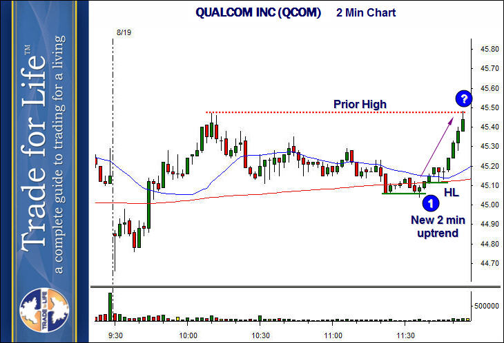
Below is a two minute chart of QUALCOM INC. (QCOM). This week, we are going to look at a stock that was in a nice two minute uptrend, then hit resistance, but quickly carried higher. Next week, we will look at a similar uptrend that hit resistance, and it was totally the end of the move. Be sure to look at these two weeks together, as it is simply too long to put it all in one lesson.

QCOM had a strong move up this morning, and as it typically happens, spent some time resting and pulling back before continuing higher. We can see the two minute chart resume an uptrend, as an equal low formed at ‘1’, then a higher low formed (HL), after the stock broke across the resistance at 45.15. The resulting uptrend was strong, and carried all the way to the “?”, which is there, due to the prior high we are running into. This prior high was the high of the day, and the market pulled away from the prior high for almost two hours. This resistance area is nothing to ignore, but will it be the end of the move? Will the next pullback be buyable, or will the stock begin falling.
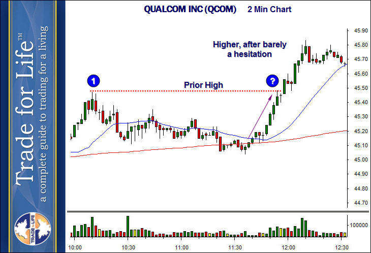
Here is what the stock did, and then we will discuss two key things to look for.

The question mark is in the same place, so you can see that QCOM barely stalled before going significantly higher. The prior resistance at ‘1’ could have been ignored in this case. However, how do you know? Here are two things to look for.
First, look at the type of prior high that was set. At ‘1’, we have formed what we call a ‘simple pivot’. That is what you want to see, if you want the stock to go higher. This type of prior high offers the least resistance. All this means is that the higher bar of the last high, at ‘1’, had sequentially lower highs on each side. It is a ‘V’ top. The opposite would be to have a series of bars that had similar highs, or went higher and lower. This then forms a base, or a squared top, or a rounded top, all of which are signs of the bears gaining strength in that area.
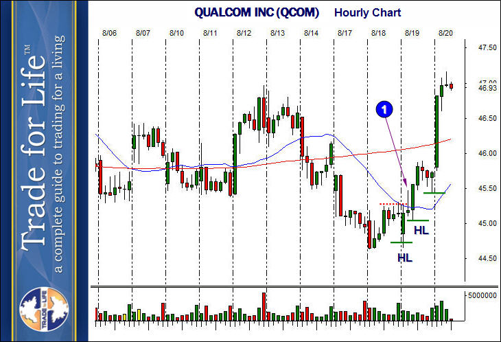
The second thing to look for, and usually the more important one, is the bigger picture. Look what was happening on the hourly chart of QCOM at this time.

The “1” is showing the morning high set on the two minute chart at about 10:10 in the morning of the 19th, the day we are examining. Note, that that morning, the first higher low (HL) was set on the hourly chart, and the rally to ‘1’, traded above a significant prior high (red dotted line), and the pullback that set up the late morning rally, set another higher low. This means we had a full fledged uptrend underway on the hourly chart, as well as the new uptrend on the two minute chart. Prior highs are ‘suppose’ to give in to rallies, when in uptrends. That is the definition of an uptrend.
Next week we will look at a similar two minute rally, but one that did not play out the same, and look at the reason why. Be sure to save this lesson so you can compare both next week.